A/B Testing in Portal
Long-time brokerage clients still relied on mailed monthly statements.
How can we change a long-standing habit?
-
Ability
Clients would be more receptive to change if it were easy to do and the choices clear.
-
Motivation
Why should they care or change? Finding out what would move a client paperless would be essential.
-
Opportunity
We’d have one opportunity in our technical roadmap this year to help clients change their preference.
Time was of the essence.
Before we start designing, what are the hurdles
-
Client mindset
Cognitive bias: The pain of loss is stronger than the power of gain. Past campaigns failed - even with incentives.
(This had us questioning: Was the change better for the company or the client?) -
Time limitations
We had to work within a short timeframe and with a more conservative design pattern. An omni-channel messaging strategy (emails, secure messaging and SMS) were out of scope.
(But hey, limitations are part of the fun!) -
Platform requirements
Current UI was complex and our language was too detailed - adding to customer resistance.
(Let’s clear the path!)
Creating the right flow
We couldn’t rely on the portal navigation which was out of date and not intuitive.
We needed to get the client’s undivided attention -
which meant right after login.
Quick research reality check
We theorized offers like financial incentives, charges for mailed documents, saving trees wouldn’t be compelling. Competitive intelligence and past paperless bank campaigns proved us right.
However, we still weren’t clear on the hook.
In a quick UX study on potential benefits and features, clients reacted positively to an organization message. But more crucial, clients needed annual tax statements mailed. They were too important.
A/B Test
10-10-80
-

Control Message A
Seen by 10% of the population.
Showing a clear visual representation of the product/service value is a cognitive bias. -

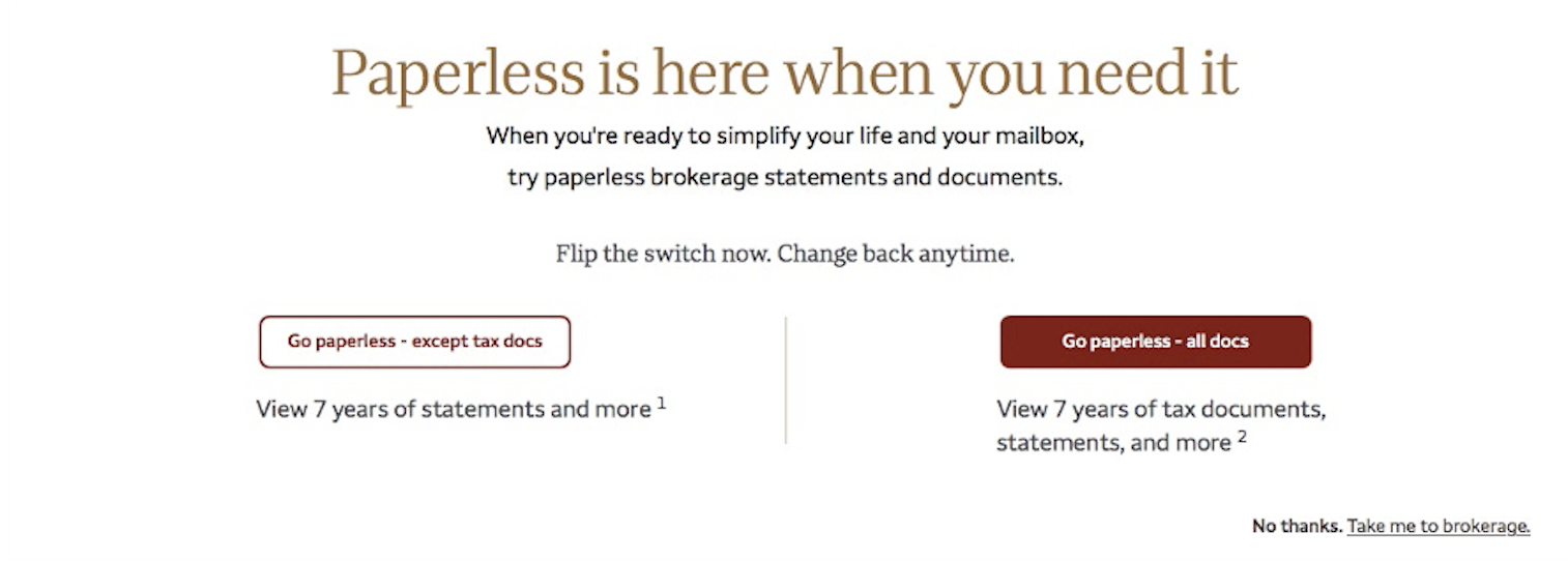
Variant Message B
Seen by 10% of the population.
Give clients control. No slick marketing message - just a soft sell.
We had a winner
Variant B had an 8% lift in conversions over the Control
The winning design was pushed to the remaining
80% of the population. In 3 weeks, company saved hundreds of thousands of dollars in postage and printing monthly statements.
Our UX design hit the sweet spot.
A great design works for all.
The business had a lift in monthly online activity.
Clients got the control they were looking for, and we avoided harming the brand reputation.

